Mockups Have Become Storytelling Assets
The strongest mockups no longer sit quietly as static previews. They now function as storytelling assets, helping a product feel like it already exists in the world it is meant to serve. That shift matters because buyers, investors, and clients do not respond to isolated screens in the same way they respond to a product placed inside a believable context. A landing page framed in a real environment, a SaaS dashboard shown in a founder’s workflow, or a device render staged for a launch deck instantly carries more weight than a flat image. Contemporary mockup trends increasingly emphasize narrative scenes, emotional context, and brand-specific environments rather than generic layouts.[1][6]
For agencies, this changes the job of presentation design. Instead of simply showing what something looks like, the goal is to show what it means and how it fits into a market. A mockup for a fintech dashboard should feel different from one for a wellness app, just as a premium startup brand should not be framed with the same visual language as a commodity tool. That is why custom scenes, tailored copy, and brand-matched textures are becoming more valuable than stock-ready visuals. In practice, a better mockup can shorten the distance between concept and conviction.[2][5]
When a mockup tells a credible story, it stops being decoration and starts functioning as proof.
This is especially useful in brand identity, launch decks, and marketing pages, where the visual must communicate maturity before the product is fully in market.[6] The best teams now treat mockups as part of the sales narrative, not as an afterthought added at the end.
Motion Is Turning Presentations Into Product Experiences
Animated mockups are quickly becoming the new baseline for digital work. Static screens can still do the job, but they rarely capture the rhythm of a real product: the hover state, the swipe, the transition, the loading moment, the flow between steps. Trend coverage points to animated mockups as an increasingly essential way to show digital products in realistic settings, while broader presentation guidance recommends short clips and narration to make product tours, onboarding, and recaps more memorable.[1][3] For founders and agencies, this means a portfolio page or pitch deck can do more than inform. It can move.
This shift is especially powerful in the age of product-led growth. A micro-animation can explain more than a paragraph. A looped device demo can show a signup flow, dashboard interaction, or app motion in seconds. A motion-first deck can make a prototype feel like a release candidate. These techniques are not cosmetic; they reduce uncertainty. If someone can see how a product behaves, they do not have to imagine as much, and that often increases trust. That is why motion works so well for SaaS launches, product demos, and investor storytelling.[1][3][4]
The most practical way to apply this is to keep motion focused and readable. Use a short product clip at the top of a landing page, a subtle device loop in a slide, or a before-and-after transition inside a case study. Do not overload every screen with animation. Instead, design a few moments that carry the story. For teams building in Next.js, pairing these visuals with fast-loading sections and lightweight embeds can preserve performance while still feeling premium.
Accessibility Is Now Part of the Design Standard
Presentation quality is no longer measured only by polish. It is also measured by readability, contrast, hierarchy, and how well the content works in different environments. Slidesgo’s 2026 presentation trends call out larger type, clearer hierarchy, and strong contrast as baseline expectations, with specific guidance such as 24–32 pt body text and 44–64 pt titles.[4] That is a major signal for agencies and founders: the best-looking deck is not the one with the most visual complexity, but the one people can understand instantly on a laptop, a phone, or a conference room screen.
Accessibility has direct business value. Investor decks get skimmed. Sales decks get forwarded. Product presentations are often viewed in less-than-ideal conditions, including remote calls, crowded events, and mobile previews. If the typography is too small, the message gets lost before the story starts. If contrast is weak, even strong visuals fail to carry the argument. This is why mockups and presentation layouts must work together: the mockup should reinforce the content, not compete with it.[4][5]
For practical execution, teams should build a reusable presentation system with clear type scale, consistent spacing, and image crops that leave room for labels and callouts. Use fewer words per slide, larger titles, and stronger separation between sections. If you are preparing a client deck in Canva or Figma, design for the worst viewing condition first, then refine for the best one. That discipline produces decks that feel premium because they are usable.
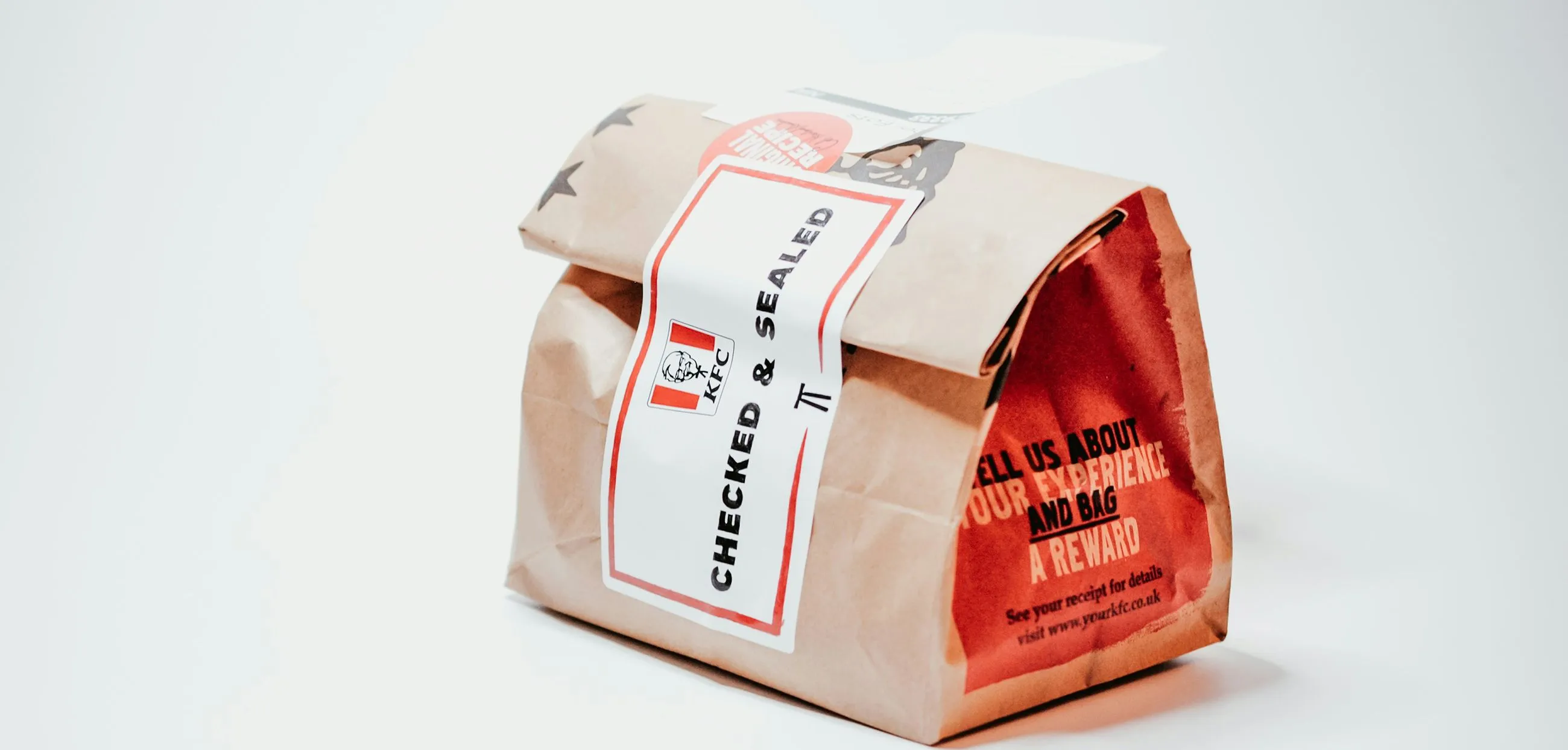
Device Mockups Still Matter, Especially for SaaS and Apps
Despite all the changes in presentation design, device mockups remain one of the most effective tools for product marketing. They are still the fastest way to show how software looks across smartphones, tablets, and desktops, which is especially important for responsive products and multi-surface workflows.[3][5][7] A clean multi-device hero section can communicate product maturity in a single glance. For SaaS founders, that often means the difference between looking like a concept and looking ready to scale.
Device mockups are also useful for testing the visual hierarchy of a product story. If a feature only makes sense when the mockup is tiny or tightly cropped, it may not deserve primary placement. If the core interface remains understandable across device sizes, it is a stronger candidate for the homepage, investor deck, or onboarding presentation. This makes mockups a strategic tool, not only a design asset.[5][7]
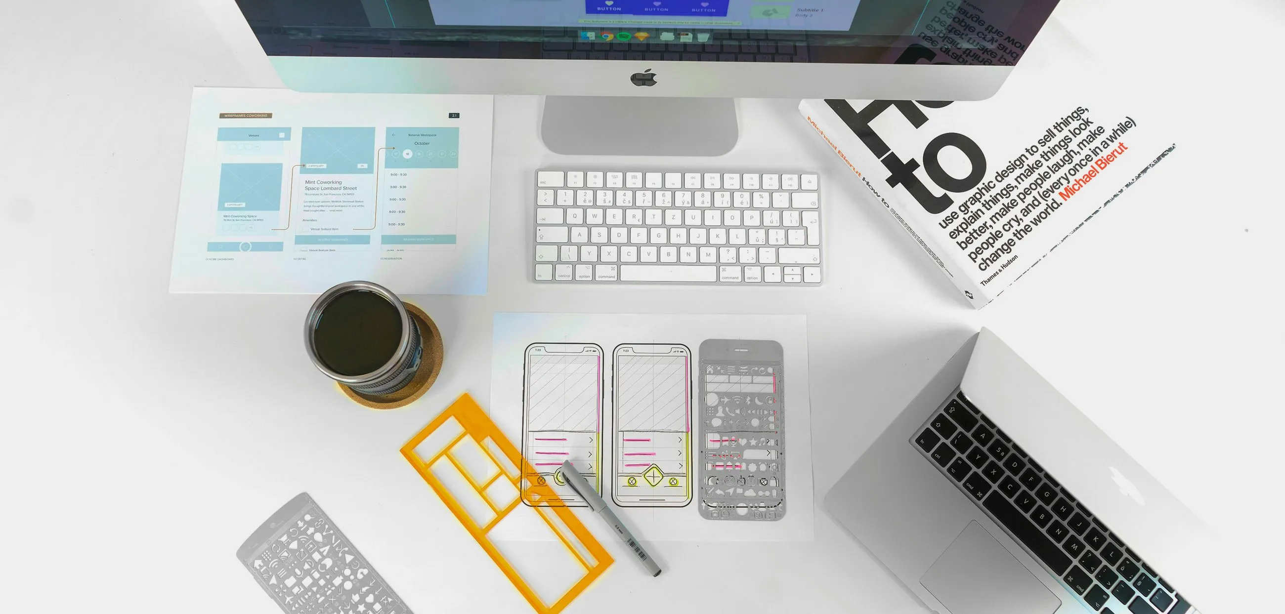
The most effective teams now build custom mockup libraries instead of relying on generic stock visuals. That allows every pitch, one-pager, and launch image to align with the same identity system: the same colors, the same type balance, the same atmosphere. Figma Community remains a common source for reusable components, while tools like Envato Elements, Freepik, and Shot.so support faster production when timelines are tight.[2][7] For agencies, that combination of consistency and speed is the real advantage.
The New Advantage: Faster Production Without Losing Brand Precision
AI-assisted workflows are changing how mockups and presentations get made. Current trend coverage points to AI-supported auto-layout, spacing suggestions, and other production accelerators as part of modern slide creation, while mockup coverage notes that automation is helping teams handle repetitive tasks and improve design efficiency.[1][4] For agencies, the practical gain is not just speed. It is the ability to move from draft to client-ready asset with fewer manual bottlenecks. That matters when you are creating proposal decks, launch visuals, or sales collateral across multiple clients at once.
The opportunity is to combine automation with a strong system. Use AI to speed up layout variants, device framing, or content structure, but keep the core brand logic human-led. The best decks still depend on judgment: which visual earns attention, which screen deserves emphasis, which layout feels credible for the audience, and which motion supports the message without distracting from it. The teams that win will not be the ones using the most tools. They will be the ones using the right tools in a repeatable workflow.[1][4][6]
For founders and builders, that workflow can be surprisingly lean. Start with research-backed wireframes, move into brand-specific mockups, then layer in motion only where it strengthens the story. In a stack built around Next.js, Supabase, Vercel, Cursor AI, or n8n, the same principle applies: design the system once, then let it scale. When mockups, motion, and accessibility are aligned, the result is not just a better presentation. It is a stronger signal that the product is built to ship.